Educational Platform | Online Learning Marketplace
Project Overview
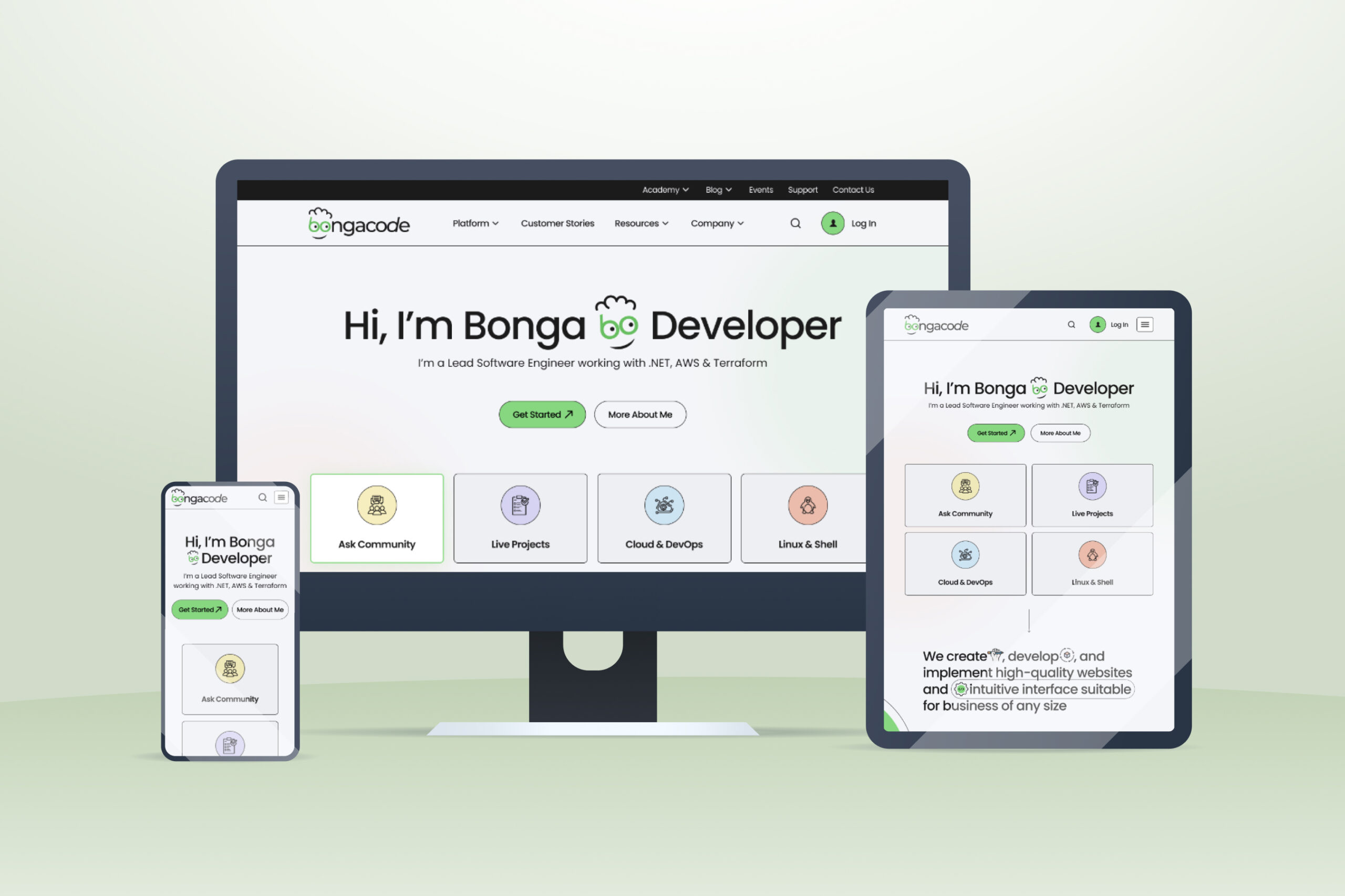
Bongacode Bonga Developer is an online learning platform created for aspiring developers, software engineers, and IT professionals seeking practical technology education. The platform combines tutorials, premium eBooks, video courses, community engagement, and career-focused learning resources into a single ecosystem.
The goal was to create a modern educational brand that feels approachable for beginners while maintaining credibility for experienced developers.
Challenge & Solution
Presenting tutorials, courses, ebooks, and community features on one homepage without overwhelming users while maintaining clear navigation and strong conversion opportunities.
Organized content into structured sections, used card-based layouts, clear visual hierarchy, and prominent CTAs to create an intuitive learning journey and improve engagement.
Research
Before starting the design process, I analyzed leading platforms such as Udemy and Coursera to identify industry best practices in content organization, course discovery, and user engagement. Research shows that users typically decide whether to stay on a website within a few seconds and prefer clear navigation, structured learning paths, and visible social proof. These insights helped shape a user-centered experience focused on easy content discovery, credibility, and seamless access to tutorials, courses, and premium learning resources.

Competitor Benchmark Analysis

User Goals & Pain Points

Learning Behavior Insights
Design Process
Wireframes
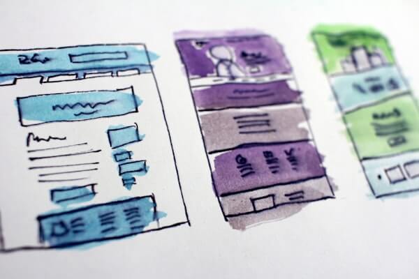
I started with low-fidelity wireframes to explore layout structure, navigation flow, and content placement. This helped validate ideas early, refine user journeys, and ensure a clear foundation before moving into visual design.

Desktop wireframe layout design

Mobile wireframe simplified structure
Final Designs
The final design introduced a structured learning interface with improved navigation across tutorials, courses, ebooks, and community sections, along with a refined content hierarchy and clearer call-to-action placement for better discovery and engagement.


"Yogesh completely changed how we think about knowledge surfaces. The new learning experience is easy to use and has reduced the time we spend finding resources by approx 40%."
Raj Kumar, Founder of BongacodeDesign System
One of the most valuable deliverables from this project was a full design system built in Figma — 120+ components, 8 typography styles, a token-based colour system, and documented interaction patterns. This became the foundation for all new feature development across Knowmax.

Colour tokens & typography system

Colour tokens & typography system

Colour tokens & typography system
Results & Impact
Key Learnings